Checkout Landing & Simulator – A Visual Case Study
I was tasked with transforming Chargebee’s checkout journey into an engaging, interactive experience that clearly differentiated us from competitors like Stripe and gave prospects a hands-on preview of the payment flow.
Date
August 2024
Role
Lead Designer
Company
Chargebee
Problem Statement
Needed to differentiate Chargebee’s checkout experience from Stripe’s polished standard.
Marketing site lacked an interactive way to showcase the product’s actual payment flow.
Prospects couldn’t “feel” the checkout before signing up, limiting engagement.
Design & Development Approach
Stakeholder Alignment: Held discovery sessions with PMs, PMMs, and solutions teams to map out the real payment workflow.
Content Capture: Pulled in-product screenshots to ensure accuracy in storytelling.
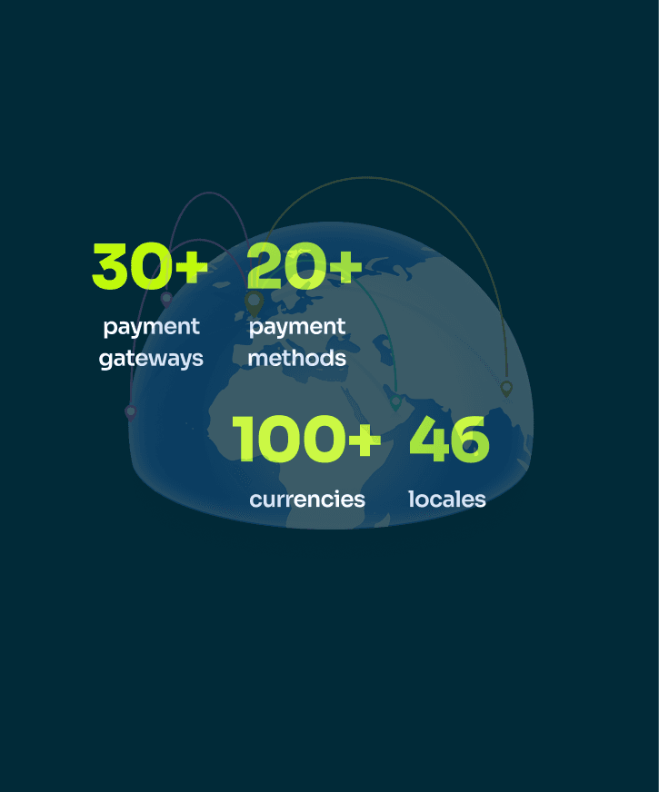
Lottie Animations: Designed dynamic animations highlighting global reach and key checkout steps.
Interactive Simulator: Built an embedded checkout simulator for users to customize amounts and experience the flow firsthand—all within a marketing page.
Brand-Forward Aesthetic: Applied the latest Chargebee brand guidelines, infusing a fresh, startup-driven visual style.
Outcome & Impact
Engagement Surge: Checkout page visits and simulator interactions doubled within two weeks. Business Recognition: Awarded GD USA’s Digital Design honor for creating one of the most immersive, conversion-focused marketing experiences.